
A Wardley map is a map of the structure of a business or service, mapping the components needed to serve the customer or user. This is the definition that Wikipedia gives to this truly interesting framework, that I have discovered while researching the Strategy Framework article I recently published. It derives from the work of Simon Wardley, a former CEO and strategy consultant who has invented this toolkit in 2005. He hosts on Medium what is practically an 18 chapters book/guide on the methodology, that starts with a chapter titled “On Being Lost“.
The origin of his idea is pretty simple: as an executive he had difficulty answering the question Does this strategy makes sense? He started looking for a framework, a system of reference that could help him answer that question. He didn’t find one that would satisfy him.
More brutally, I was lost at sea and looking for something to grab hold off, an executive lifeboat.
Simon Wardley, On Being Lost
The Starting Point
His Serendipity moment was when he picked up a copy of Sun Tzu’s The Art of War. It was the illustration of the 5 Factors (that I have recently covered as a specific Strategy framework) that made him realise that most Strategy Documents, as well as Strategy Literature, would “jump” from the Purpose (or Tao/Dao) to the Leadership or execution. There was no evident consideration of the other elements.
As he analysed ancient military strategy, he noticed that in most cases one of the vital elements to understand the success of a strategy was to look at a map of the battlefield. These maps had two essential elements that made them useful: they are visual and context-specific. Each map had six basic elements that Wardley identifies as vital: visual representation, context-specific, the position of components relative to some form of anchor and movement of those components. These where the elements that he felt missing also in the strategy frameworks that he had been studying.
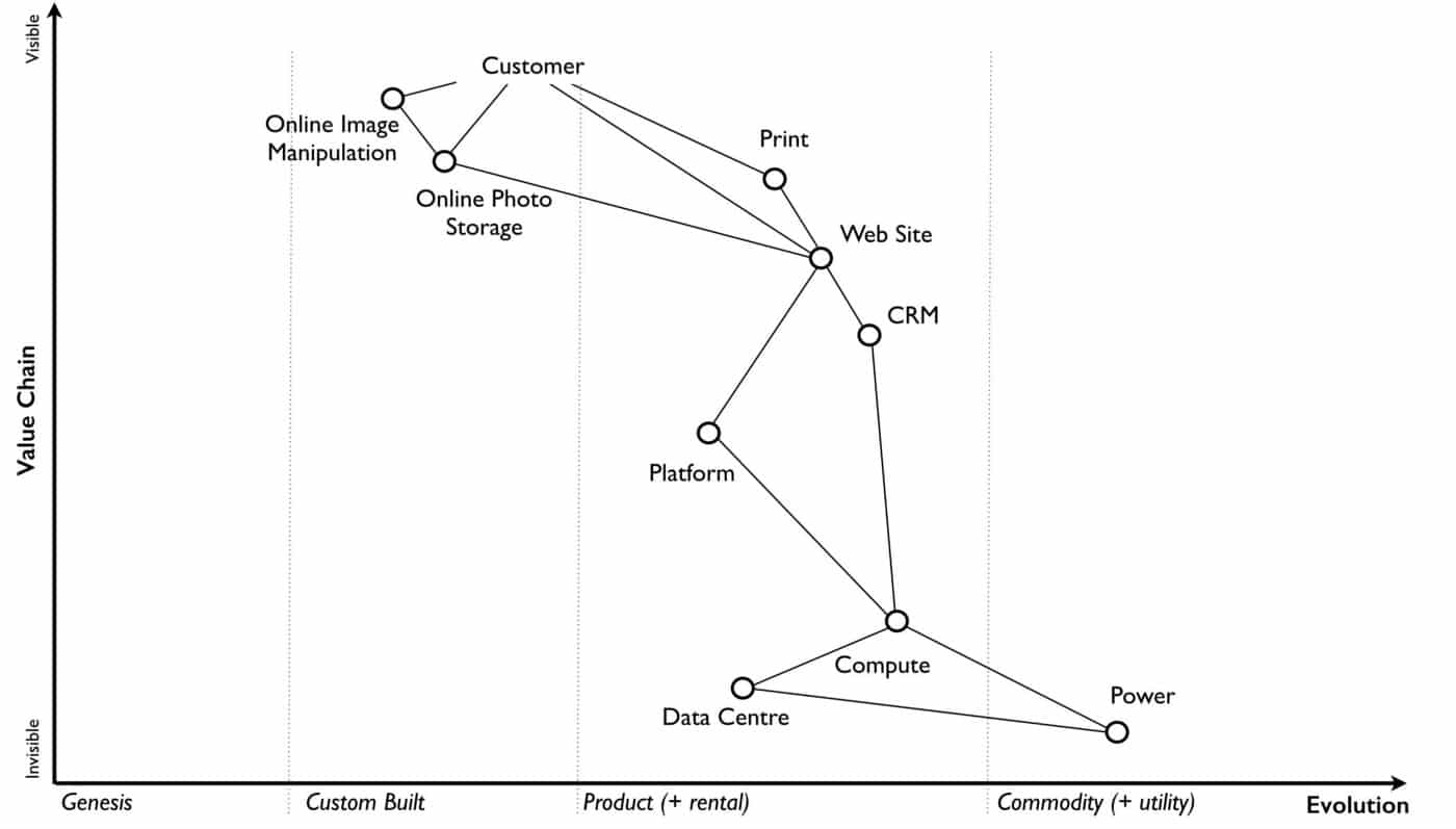
The result is Wardley Map, a visual representation of the entire strategic setting of business. The map is visual and context-specific i.e. it is unique to that line of business containing the components that influence it at that moment in time. The position of components in the map are shown relative to that user on a value chain, represented by the y-axis. Each component needs the component below it, however, the higher up the map a component is then the more visible it becomes to the user. The lower it is then the less visible it becomes.
Stages of Evolution
The other brilliant element of the map is the position of the components on the x-axis. Wardley has reasoned a lot on what is the journey of “innovation”, from novel to commonplace. What he realised is that things not only evolved from novel to commonplace enabling new things to appear but they also allowed for new forms of practice and organisation.
Throughout our history, it has always been standardisation of components that has enabled creations of greater complexity.
Simon Wardley, Finding a Path
This intuition has led of the identification of a stage of evolution of the components of the map. These are:-
- Genesis. This represents the unique, the very rare, the uncertain, the constantly changing and the newly discovered. Our focus is on exploration.
- Custom built. This represents the very uncommon and that which we are still learning about. It is individually made and tailored for a specific environment. It is bespoke. It frequently changes. It is an artisan skill. You wouldn’t expect to see two of these that are the same. Our focus is on learning and our craft.
- Product (including rental). This represents the increasingly common, the manufactured through a repeatable process, the more defined, the better understood. Change becomes slower here. Whilst there exists differentiation particularly in the early stages there is increased stability and sameness. You will often see many of the same product. Our focus is on refining and improving.
- Commodity (including utility). This represents scale and volume operations of production, the highly standardised, the defined, the fixed, the undifferentiated, the fit for a specific known purpose and repetition, repetition and more repetition. Our focus is on ruthless removal of deviation, on industrialisation, and operational efficiency. With time we become habituated to the act, it is increasingly less visible and we often forget it’s even there.

Key Features of the Map
A Wardley Map also has some advanced features which are not so immediately obvious when first looking. There is a flow of risk, information and money between components. The components can also represent different elements that can find a place on the map, and each is associated with a different interpretation of the stages of Evolution. Elements types represent activities, practices, data and knowledge.

Finally also climate can be represented on a Map, as illustrated in Figure 4 which delivers a representation of the advanced features all together.

How to Draw a Map?
Simon Wardley gives clear indications on how to draw a Map and explores in depth in the further chapters of his work the features and usage of the tool.
Here a summary of the essential steps:
- Start with the needs. A single node on one map can be an entire map from another person’s perspective. Equally, the entire map of your business might be a single component for someone else.
- Value Chain. Answer the question “what components do we need in order to build this capability?”
- Map. Ask the following questions for each component:
- How ubiquitous and well defined is the component?
- Do all my competitors use such a component?
- Is the component available as a product or a utility service?
- Is this something new?
He also delivers a well detailed “cheat-sheet” on how to produce these maps.

Conclusion: Wardley Maps as a versatile toolkit
I found this framework to be truly brilliant and effective. Maps are fundamentally a communication and learning tool. Visualising an entire Business on such a map has enormous value especially for companies that are ready to embrace the concept of Strategy as Learning. Not anymore a static document that represents a plan of execution, but a guide for everybody to ensure full understanding of where we are, and where we want to be.
The tool also expresses a high level of consistency, especially in allowing to frame Intentional Design. The focus on the customer is a key focal point, assumed as a Doctrine by the model. No more strategies blindly focused solely on profit, with only incidental consideration of the customer.
By meeting the needs of your customers then you should aim to satisfy your business needs to make revenue and profit, not the other way around.
Simon Wardley, Doctrine
There is a lot more richness in the approach, and will continue to investigate this further. I believe there is an additional value in this mapping framework, to assist in Change Management programs, by allowing to net the gaps between AS-IS and TO-BE for example. There are many resources online to learn the tool as well as to provide visualisation, plus an active community.
Stay tuned for further explorations.
And you? Did you already know the Wardley Map framework? Feel free to drop a feedback in the comments below.

Cover Photo by Capturing the human heart. on Unsplash
Hi, a find-of-the-day! I can see how this type of map could be useful in many instances. Thank you for spreading the word.